A few years ago, I spent a lot of time playing the game Half-Life. Not the single player story, or deathmatch, but playing movement maps on multiplayer servers. The aim of these maps are to exploit the game’s movement mechanics to complete them as fast as possible. To move fast in Half-Life, a technique called Bunnyhopping is used, where you gain speed by alternating between moving left while looking left, then moving right while looking right, all while continuously jumping to avoid ground friction.1
Here’s an example using the replay viewer I modified - click below to watch. Motion sickness warning! (Refresh if it doesn’t appear)
There are over 4500 maps like this one to play on community servers and a nice community of players competing for the best records. The problem with so many maps is that it can be hard to find fun ones to grind out times on. Sometimes, when you come across a good map that you like, you wish you could find similar ones, rather than switching through random ones until you come across another fun one.
Inspired by this pain point, I wondered whether it would be possible to make a recommendation system that could be integrated into the server plugin, to recommend maps similar to a given map. This could be extended to give players suggestions on which to play, based on how they have rated other maps.
What defines a map?
It’s a difficult question. Some maps are straight lines, some have lots of turns; some are short, some are long.
To find similar maps, we need to have a quantifiable way to compare them. We need to mathematically define the difference between a map which is a straight line and one with lots of turns, and to come up with other distinguishing features that we can extract from our available data.
What “available data”?
As seen above, replays are saved when a player sets a personal best time on a map. Being good friends with the server owners, I was able to obtain access to all of these replay files, containing
- The player’s position on the map (3D coordinates)
- The player’s viewing angles
- What keys the player is pressing
All these for each frame of each replay, at 250 frames per second! Furthermore, some replays come with statistics such as total distance travelled, average speed, etc. There are also the map files themselves, but I didn’t find a use for them.
Engineering features
First, I thought of features which would vary across different maps. Immediate choices were the time to complete the map, and the average and maximum speed. Some of the runs come with this information included, and for others it had to be estimated — more about that later. However, these alone don’t tell us much about the “style” of the map.
Strafe styles
I wanted to encompass the fact that some maps require consistent, periodic strafes (horizontal mouse motions) whereas some have no strong pattern because they are slower or involve more verticality. To illustrate, here’s a graph of the yaw (horizontal axis) viewing angle over time of a popular map (fastrun) that is simply a straight line from start to finish.
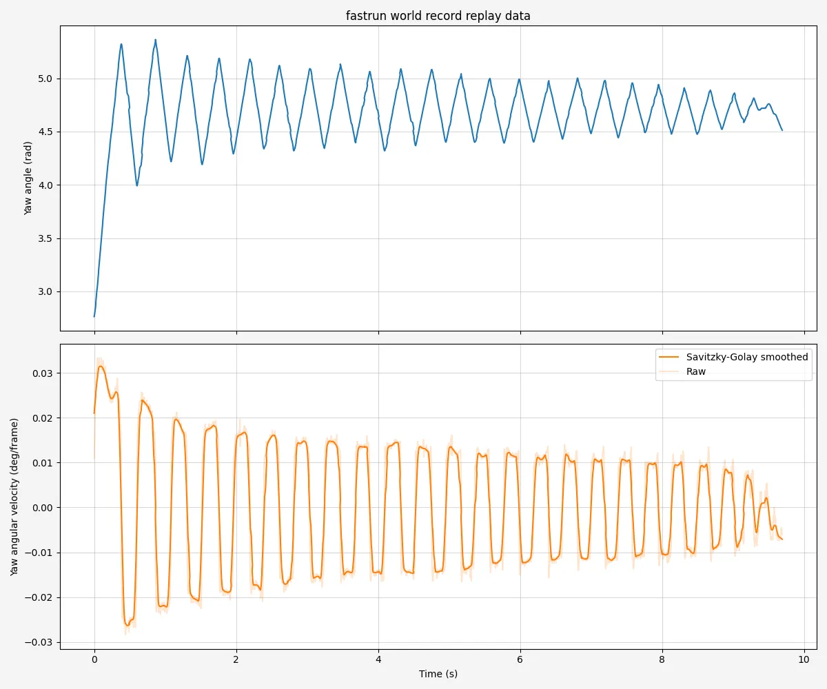
The yaw angle is shown in blue, and its rate of change in orange. A positive rate of change means turning towards the left, and a negative means turning towards the right. Naturally, it alternates between positive and negative as the player repeatedly turns. Here’s a map (ksz_woodup) which is a big twisting vertical climb.
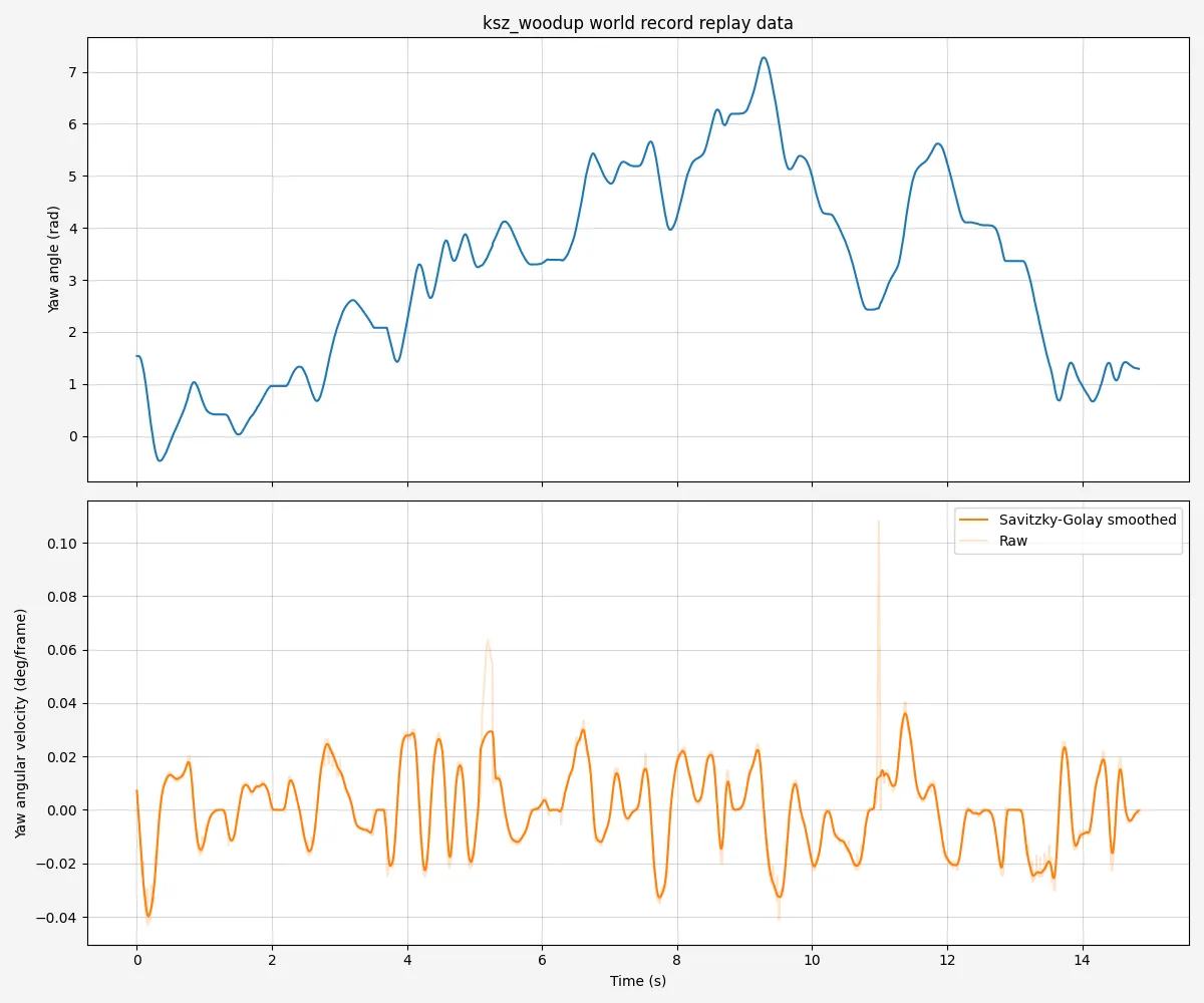
Just from observing yaw angles, we can see that these two maps are different.
You may notice that the graphs have a smoothed line and a raw, unsmoothed one. As this is a multiplayer game, packets can arrive out of order, and angles experience a loss in precision. This causes a noisy signal, especially for replays from players with high latency. To compensate, the derivative is smoothed when calculating angular velocity. I went for a Savitzky-Golay filter to preserve peaks better than a moving average.
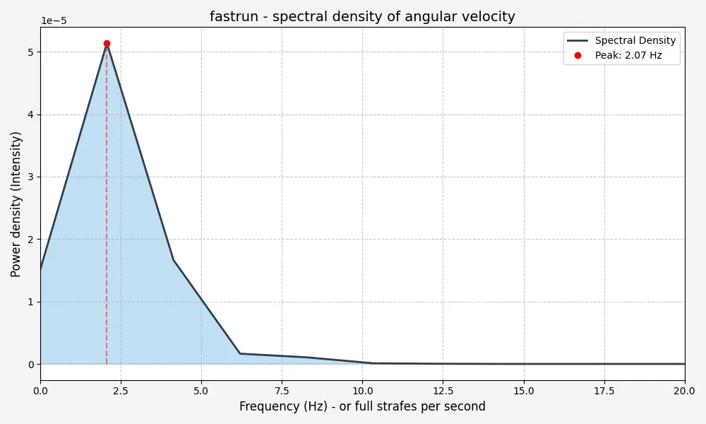
To find the underlying rhythm of the player’s movement, we need to shift from the time domain (how the angle changes over time) to the frequency domain (how often certain patterns repeat). We do this by calculating the power spectral density, which provides a statistical breakdown of which frequencies are most prominent in the player’s mouse movement. Looking at the first graph, we see that the player does roughly four strafes per second. However, a complete cycle in frequency terms consists of one move left and one move right, basically a return to the previous mouse position. Thus we expect to see a peak at 2 Hz. Here is the power spectral density for fastrun:
I extracted five features from this data:
- Peak frequency
- Intensity of peak frequency
- Spectral centroid - the “center of mass” of the spectrum
- Spectral entropy - High values indicate a flatter, more disordered spectrum, whereas low values indicate large peaks
- “Fast strafe ratio” - Ratio of cumulative intensities of frequencies over 1.5 Hz to those less than that. 1.5 Hz is chosen arbitrarily as a point I consider strafing to be fast.
Map geometry
Next, I wanted to get some measure of the shape of the map, as the strafe style alone wouldn’t account for it. As pointed out earlier, some maps are more vertical and twisty, and others are more flat. To quantify this, I calculated two measures: elevation gain rate, and tortuosity.
Tortuosity is the measure of how winding or twisty the player’s trajectory is. It’s calculated by taking the total length of the player’s 3D trajectory divided by the straight-line distance from start to finish. Hence if the player went exactly straight, this would be equal to 1, and the more twisting the path taken, the higher the ratio. For fastrun, this ends up being 1.04, i.e. very close to perfectly straight. Calculating this proved to be a challenge, again due to signal noise. I had to smooth each of the X, Y, and Z displacements before taking the norm and summing them to obtain an accurate path length measurement.
Elevation gain rate is fairly self explanatory. It’s a measure the average rate of increase of the Z coordinate. Only frames when the player is on the ground are used to calculate it, to avoid inflating the value from the player’s constant jumps which only temporarily increase the height. For fastrun this is 0, because the map is perfectly flat.
However, for some maps, I saw highly unrealistic numbers. The offending maps ended up being those containing teleports. On some maps, there are teleports that instantly bring you to some other point in the coordinate space. This obviously threw off both of these statistics. To address this, I first performed segmentation - going through the replay and checking when there is a distance travelled of more than 174 units in any direction over a single frame.2 Then, I calculated the tortuosity and elevation gain on each of these segments, then averaged the values, weighted by the length of each segment relative to the total. This fixed the issue, and I also included the number of teleports as a feature itself.
Speed related features
As mentioned earlier, some replays come with statistics pre-computed. The relevant ones are average speed, max speed, and slowdowns. Unfortunately, for some replays these have to be estimated. Calculating speed is simple enough, but the resulting data is extremely noisy. I filter it by doing a rolling Z-score test — removing outliers over 2 standard deviations away — then interpolating, and finally passing a smoothing filter. The result look likes this for fastrun:
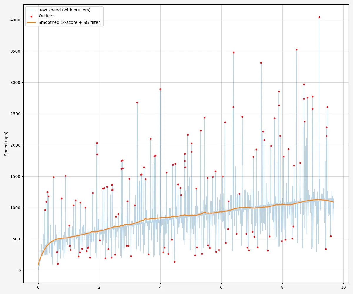
From the speed per segment, I calculate average and max speed and the number of slowdowns (when the speed drops by a certain amount within a small time window). Also, slowdowns is divided by length of the map, because its natural that longer maps are more likely to have slowdowns.
Putting it all together
With the features calculated for all the maps with replays, we have 4,500 datapoints.3 Using a dimensionality reduction algorithm (UMAP), we can find an embedding of the data in two dimensions. I then visualised this embedding as a 2D plot, where closer two points are, the more similar they are according to the features. Using BokehJS, I made this into an interactive plot: Click here to see the end result! You can hover over a data point to see the name of the map, and click on it to open it in the replay viewer.
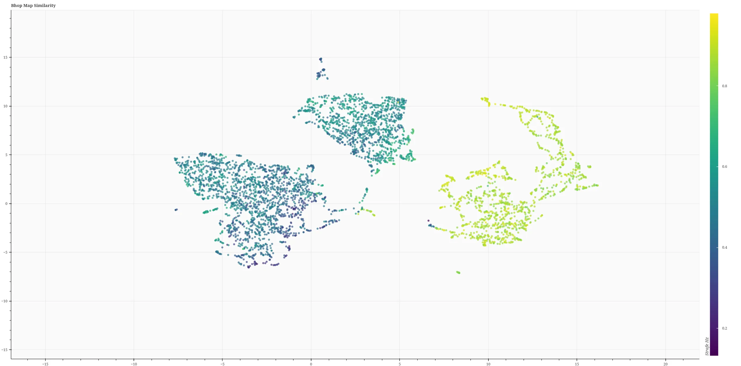
The colouring is given by the “fast strafe ratio” feature described previously. There are some clear large clusters, but it’s difficult to interpret exactly what separates points within them. In any case, the plot is quite accurate, according to my subjective opinion as a long-time player. For example, there are clusters of maps like fastrun, fastrun_98_demo, and ins_bhopstraferace,4 which are all basically the same map. There’s also a cluster of all the “ag circuit” maps,5 and a cluster of maps that have boosters. I won’t go on, but it kind of works — though not to a high enough standard that I’d be willing to integrate it into the server plugin.
It’s worth noting that this version actually doesn’t include the time taken to complete the map as a feature. I initially used it, but found that it was separating maps that were otherwise similar just with different durations.
Future ideas
There’s a list of things I’d like to give a go in relation to this:
- Exploring more/different features and their effects on the outcome. Something that will capture maps with lots of ladders seems like a good start.
- Hyperparameter tuning. There are a lot of arbitrary constants used, e.g. in smoothing, the fast strafe threshold… Exploring the impact of these on the outcome could be interesting. However as there are no labels to the maps it would be difficult to get a measure of accuracy.
- Attempting a deep learning approach to the problem.
If you have any comments on what I’ve done, I’d like to hear them! Contact me via the details at the bottom of the home page, or via the contact page.
Footnotes
-
If you want to know more, this video by Matt’s Ramblings explains how it works in detail. ↩
-
This corresponds the maximum distance you can travel having a speed of 2000 units per second in each direction (the maximum) and the physics framerate at the minimum of 20 frames per second. ↩
-
There are actually 4,601 maps with pure records, but I skipped any that were under 2 seconds long. ↩
-
The cluster is situated around (16.1, 1.85) ↩
-
This cluster is around (-5.34, -4.95). These maps are characterised by unusually high tortuosity, because they are circuits; the path length is long, but they end at the same position as the start. ↩